Categories
This year, the judges chose two categories: Covers and Books.
In each, they selected “Best in Show”—the standouts among all the entries—and then chose other winners for Covers and Books. Check out the great design selections below, read what the judges had to say, and click the “more information” buttons to view text provided by the entrants.
Note: the “more information” copy is not written or edited by PPN.
COVERS
Best in Show
COVERS
Best in Show
You’re with Stupid
kranky, Chicago, and the Reinvention of Indie Music
Author: Bruce Adams
ISBN: 9781477321201
Publisher: University of Texas
Cover design: Lonny Hurley and Derek George
Printers: Versa Press/Phoenix Color
Judges’ comments:
- Perfect treatment for the topic, expertly conveys the aesthetic of 1990s indie music graphic style, focusing on the kranky label in Chicago in particular.
- The uncoated paper-over-board gives the book a down-to-earth immediacy.
Weed Rules
Blazing the Way to a Just and Joyful Marijuana Policy
Author: Jay Wexler
ISBN: 9780520343924
Publisher: University of California Press
Cover design: Tim Green, Faceout Studio
Printers: Books International/John Pow
Judges’ comments:
- Innovative lettering, incorporating the leaf motif in an unexpected, memorable way.
- Well-executed—we particularly like the resonance between the ‘D’ and ‘U’ letterforms.
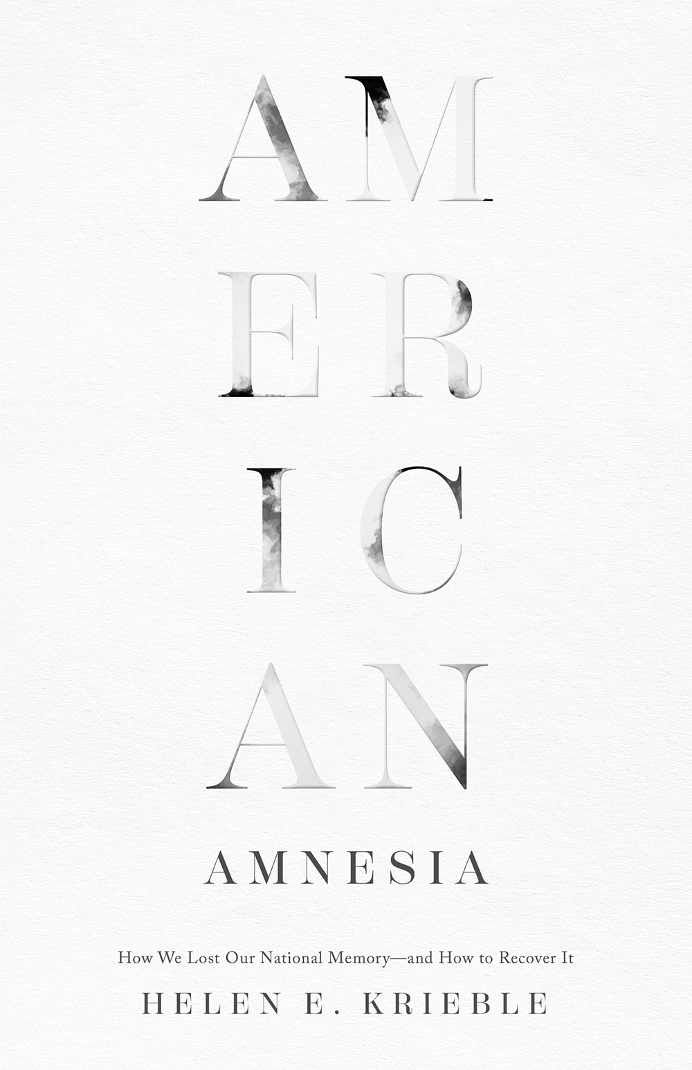
American Amnesia
How We Lost Our National Memory—and How to Recover It
Author: Helen E. Krieble
ISBN: 9781641772808
Publisher: Encounter Books
Cover design: Molly von Borstel
Judges’ comments:
- The unexpected treatment of the word ‘American’ is evocative and engaging, drawing the reader in—expressionistically conveying the book’s themes.
- The special effects are wonderfully subtle and add an extra level of richness.
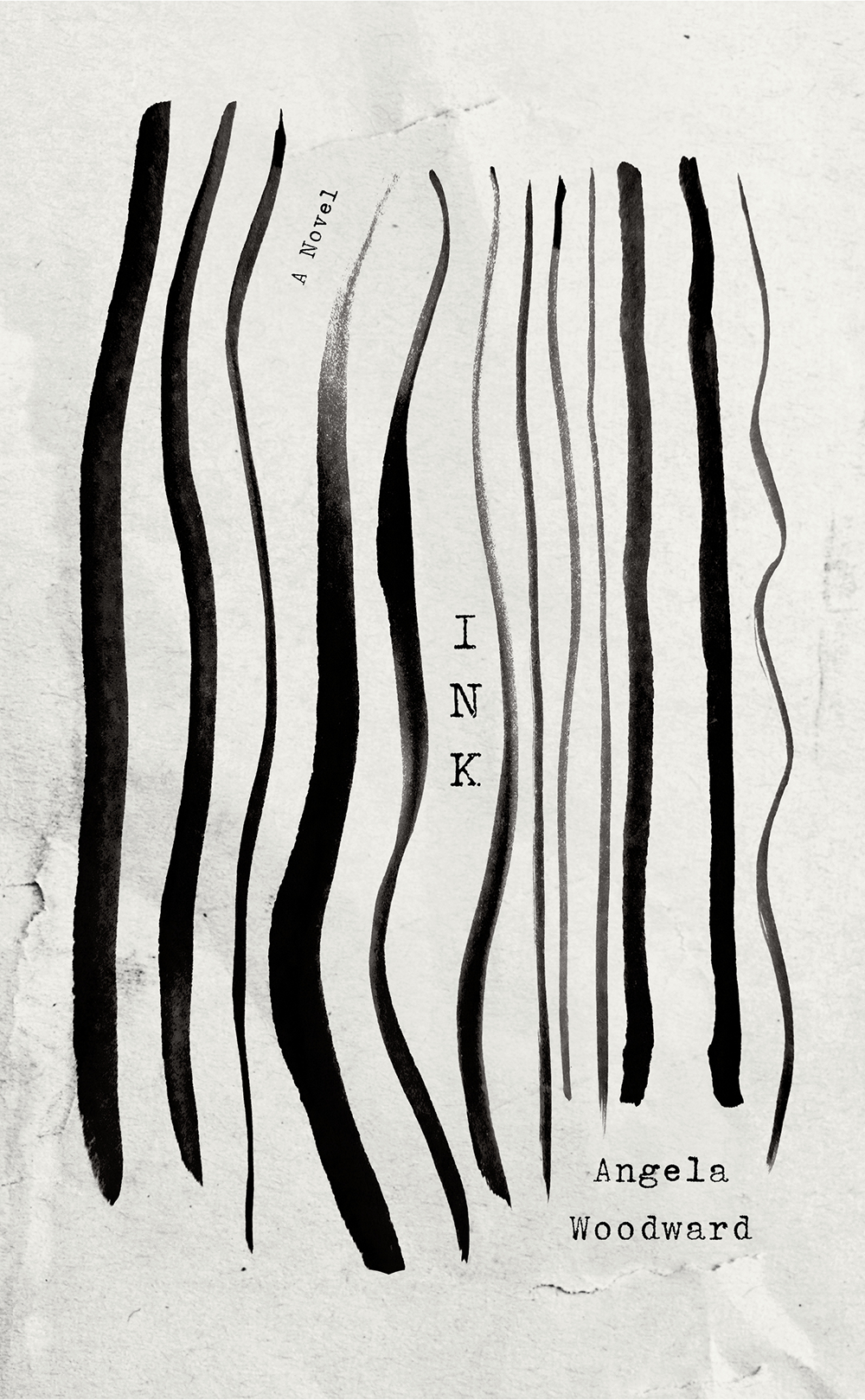
Ink
A Novel
Author: Angela Woodward
ISBN: 9780813196534
Publisher: University Press of Kentucky
Cover design: Kat Lynch
Illustration: Tanatpon Shaweewat
Judges’ comments:
- Beautifully expressive and engaging—eye-catching and lingers in the mind long afterward.
- Conceptually strong—the typewritten text evokes ink in a way that complements the illustration, anchoring the stylistic contrast.
COVERS
Winners
COVERS
Winners
Sown in the Stars
Planting by the Signs
Author: Sarah Hall
ISBN: 9780813197043
Publisher: University Press of Kentucky
Cover design: Kathleen Lynch/Black Kat Design
Printer: Versa Press
Judges’ comments:
- Nice use of a visually textured hard cover case and navy/dark green nocturnal palette, which works well for the topic intersecting astronomy and agriculture.
- The vintage woodcut style illustration pairs nicely with the wood type, and the color palette does a great job of evoking the night sky.
Your Blue and the Quiet Lament
Poems
Author: Lubna Safi
ISBN: 9781682831397
Publisher: Texas Tech University Press
Cover design: Hannah Gaskamp
Printer: Sheridan
Judges’ comments:
- A perfect cover for a debut collection of poetry: soft blue misty magic pulls you in.
- Appropriate use of soft touch lamination.
- The landscape references Syria while at the same time evoking a certain universality of experience.
Visible Borders, Invisible Economies
Living Death in Latinx Narratives
Author: Kristy Ulibarri
ISBN: 9781477326572
Publisher: University of Texas Press
Cover design: Natlile Sowa
Printers: Sheridan/Phoenix Color
Judges’ comments:
- Conceptually, this cover was a big challenge to pull off, as the title has two loaded parts and a subtitle pulls the book in yet another direction.
- Successful use of line art and color palette makes it work, while very basic font choices reflect a scholarly work from a university press.
- The brilliant color treatment subdues the illustration, challenging the viewer to take a closer look at the macabre scene.
Death of a Bookseller
A Novel of Suspense
Author: Alice Slater
ISBN: 9781613163771
Publisher: Scarlet/Pinzler Publishing
Jacket design: Tim Green, Faceout Studio
Judges’ comments:
- Another great cover from a versatile team at FaceOut Studio clearly communicates a suspense novel.
- A difficult script font to use successfully—extra points for that!
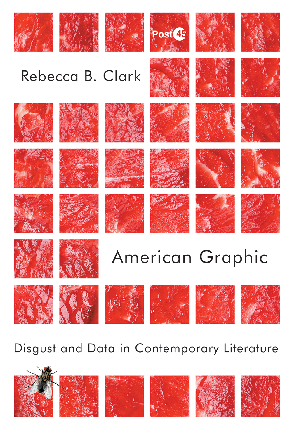
American Graphic
Disgust and Data in Contemporary Literature
Author: Rebecca B. Clark
ISBN: 9781503630970
Publisher: Stanford University Press
Cover design: David Drummond
Printer: Lightning Source
Judges’ comments:
- What a meaty title/headline! This cover delivers exactly that: orderly bits of raw texture!
BOOKS
Best in Show
BOOKS
Best in Show
Jimi
Authors: Janie Hendrix & John McDermott
ISBN: 9781797220017
Publisher: Chronicle Chroma
Designers: Tré Seals (Vocal Type) and Alexandria Martinez
Printer: Asia Pacific Offset
Judges’ comments:
- The judges loved this book inside and out.
- The cover is strong, graphic, and appropriate to its subject.
- The title typography is gorgeous. It was custom-created for the book, as are all the fonts used within, which complement the layout beautifully.
- It is not easy to bring together archival materials in a way that reads unified and lively.
- This book uses a flexible and dynamic grid that both highlights the wonderful photography and makes it easy to navigate.
Mujeres Hispanas y Tipografía
Authors: Hoffmitz Milken Center for Typography
ISBN: 97817334137
Designers: Lavinia Lascaris and Ximena Amaya
Printer: Acuprint, Marina Graphic Center
Judges’ comments:
- Original use of size, format, typography, gradients, and white space.
- The choice to create four oversized booklets, each representing a typographer, was surprising and appreciated.
- Attention to detail and a sure-handed elegance were visible in every aspect of the design and production.
The Rob Roy Kelly American Wood Type Collection
A History and Catalog
Author: David Shields
ISBN: 9781477323687
Publisher: University of Texas Press
Designer: David Shields
Printer: Asia Pacific Offset
Judges’ comments:
- Described by the judges as a “designer’s love letter,” in which the choices made by David Shields, both the author and designer, are dynamic, elegant, and always serving the interest of the visuals.
- Typographic detail and thoughtful use of white space provide a compelling framework for the book’s type-centric visual content.
- A complex design with a lot of elements to manage.
BOOKS
Winners
Seen and Unseen
Author: Elizabeth Partridge
ISBN: 9781452165103
Publisher: Chronicle Books
Designers: Lauren Tamaki and Lydia Ortiz
Printer: C&C Offset Printing
Judges’ comments:
- A beautiful merging of illustration, typography, hand lettering, and photography.
- Both new and old, innovative and retro, all at the same time.
- Type and illustrations work together in a way that is original, and reflects expert attention to visual balance.
- The design helps tell stories of a harsh time in a way that is palatable and engaging.
BOOKS
Winners
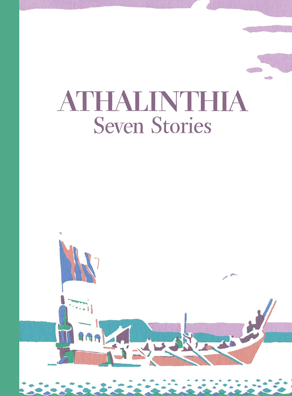
Athalinthia
Seven Stories
Author: W.A. Dwiggins
ISBN: 9798218082109
Publisher: Püterschein-Hartland
Designer: Bruce Kennett
Printer: Penmor Lithographers
Judges’ comments:
- Judges deemed this “an exquisite little book.”
- As opposed to the large format of other winners, this small book felt spacious, with excellent illustration and careful execution.
Pulp
A Practical Guide to Cooking with Fruit
Author: Abra Berens
ISBN: 9781797207148
Publisher: Chronicle Books
Designer: Sara Schneider
Printer: C&C Offset Printing
Judges’ comments:
- It’s light and airy.
- The printing and production values are evident.
- You can see how each piece of design—photo styling, typography, and palette—was thought out, refreshing, and well-executed.
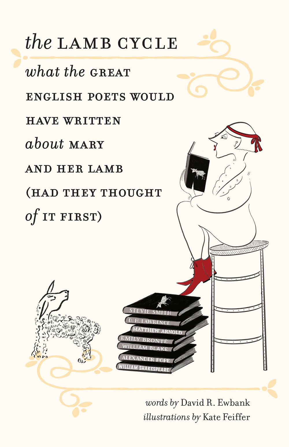
The Lamb Cycle
What the Great English Poets Would Have Written About Mary and Her Lamb (Had They Thought of It First)
Author: David Ewbank
ISBN: 9781684581450
Publisher: Brandeis University Press
Designer: Lisa Diercks (Endpaper Studio)
Printer: 1010 Printing
Judges’ comments:
- Perfectly put together, very amusing, with a just-right level of embellishment.
- The juxtaposition of text and art is creative, effective, and charming.
Deadpan
The Aesthetics of Black Inexpression
Author: Tina Post
ISBN: 9781479811212
Publisher: New York University Press
Designers: Adam B. Bohannon (cover) and Charles B. Hames (interior)
Printer: Versa
Judges’ comments:
- Chapter openers, sideways running heads, and art treatment signal something out of the ordinary, focusing attention on what is being shown.
- Nice to see this kind of attention in a one-color, text-driven book.
- Put together with thought and skill.
DJ Screw
A Life in Slow Revolution
Author: Lance Scott Walker
ISBN: 9781477325131
Publisher: University of Texas Press
Designer: Derek George
Printers: Sheridan Books and Phoenix Color
Judges’ comments:
- Using the font Helvetica feels like an innovative and non-cliché move for a book about an underground dj in Houston, Texas.
- It says that his story is not relegated to a grungy, graffiti, niche audience. It has wider appeal and importance, and is taken seriously.
Symbols of Freedom
Slavery and Resistance before the Civil War
Author: Matthew J. Clavin
ISBN: 9781479823246
Publisher: New York University Press
Designers: Adam B. Bohannon (cover) and Charles B. Hames (interior)
Printer: Sheridan
Judges’ comments:
- Inviting to read.
- Nice black text type with well composed pages.
- Chapter heads are dramatic, allusive to the historical period.
- The closer you look at it, the better it looks.
The Human Side of Innovation
The Power of People in Love with People
Author: Mauro Porcini
ISBN: 9781523002887
Publisher: Berrett-Koehler Publishers
Designers: Debbie Berne
Printer: Friesens
Judges’ comments:
- Effective use of a second color in a text-driven book—enough to add interest and accent without going overboard.
- The design is accessible and makes the book inviting.
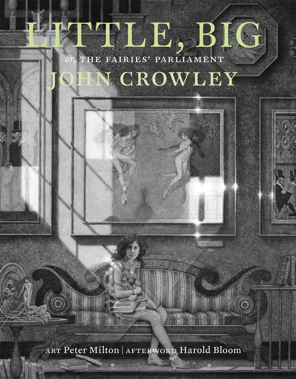
Little, Big
or, the Fairies’ Parliament
Author: John Crowley
ISBN: 9780963363756
Publisher: Incunabula
Designers: John D. Berry and Ron Drummond
Printer: Brilliant Graphics
Judges’ comments:
- The design comes across as initially classic. Its size and approach conveys that this is an important, timeless novel.
- The interesting use of imagery, including placement, cropping, and interaction with the text, signal a more modern intention.
- Many delicate touches, from the indents to the tints.
Island Wisdom
Hawaiian Traditions and Practices for a Practical Life
Authors: Kainoa Daines and Annie Daly
ISBN: 9781797216935
Publisher: Chronicle Prism
Designer: Laura Palese
Printer: C&C Offset
Judges’ comments:
- The colors are bright and beautiful.
- The photography and illustration reflect the history and culture of the subject while being joyful, fun, and inviting.
About the book:
With full legalization seeming inevitable, it’s time to shift the conversation—from whether recreational cannabis should be legalized to how. Weed Rules argues that it’s time for states to abandon their “grudging tolerance” approach to legal weed and to embrace “careful exuberance.” In this thorough and witty book, law professor Jay Wexler invites policy makers to responsibly embrace the enormous benefits of cannabis, including the joy and euphoria it brings to those who use it. This book shows how focusing on joy and community can lead us to an equitable marijuana policy in which minority communities, most harmed by the war on drugs, play a leading role in the industry. Centering pleasure and fun as legitimate policy goals, Weed Rules puts forth specific policies to advocate for a more just, sensible, and joyous post-legalization society.
About the design:
A bold and striking type treatment, showing marijuana leaves cropping up here and there within the title. This suggests marijuana policies being adopted in various places. The double meaning of the title is reinforced by the art, with a sense of celebration while also fitting within a framework of rules, with the pot leaf elements contained within the title. A bright Pantone green was used to give the cover an electric quality that jumps off the shelf.
Angela Woodward’s novel Ink tells the story of the two women who spend their days doing that neat typing. Sylvia and Marina, both single mothers, work in a suburban office building, transcribing tape recordings of witness statements describing detainee abuse at Abu Ghraib. Their ordinary preoccupations—problems with the soap in the restroom, the motives of Marina’s new love, Mr. Right, and Sylvia’s worries about paying for her son’s show choir costume—are a mundane backdrop to the violence represented by the transcripts.
Woodward layers essayistic explorations of the history of ink and writing materials into the women’s tale along with the story of the unfinished masterpiece of a French poet, and a writer’s notations about her daily commute and the lake behind her house. Then a new crime is revealed. Ink is an illuminating meditation on what it means to bear witness.
The cover design for this one needed to be both serious and visually interesting. Designer Kat Lynch dug deep and gave us an amazing array of designs to choose from, but this design in particular immediately stood out as the right one for this book. Kat was able to use an image of ink that thematically reminds us of both incarceration and neat typing, but with the paper worn and abused.
Sown in the Stars brings together the collective knowledge of farmers in central and eastern Kentucky about the custom of planting by the signs. Sarah Hall interviews nearly two dozen contemporary Kentuckians who still follow the signs of the moon and stars to guide planting, harvesting, canning and food preservation, butchering, and general farmwork. Hall explores the roots of this system in both astrology and astronomy and the profound connections felt to the stars, moon, planets, and the earth. Revealed in the personal narratives are the diverse interpretations of the practice. Some farmers and gardeners believe that the moon’s impact on crop behavior is purely scientific, while others favor a much wider interpretation of the signs and their impact on our lives. Featuring photographs by Meg Wilson, this timely book bridges the past, present, and future by broadening our understanding of this practice and revealing its potential to increase the resiliency of our current agricultural food systems.
Cover designer Kat Lynch pulled together the perfect cover — weaving together illustrations of crops and constellations to visually represent this deeply rooted Appalachian custom.
Clark analyzes the contemporary graphic along three specific axes: the ethnographic, the pornographic, andThe author suggests using a grid/graph paper background, with something visceral or grotesque in the foreground–“think a pile of offal plopped in the middle of the Cartesian Poetics cover.” She offers works from two artists: the sculptor Qimmyshimmy and the performance/collage artist Narcissister. (The latter’s performance works are analyzed in the book.) See the file on Shared for sample images from those artists, and one mockup cover. The cover needs to strike a balance between being gross and visceral, and not actively repelling prospective readers. Avoid any “American” imagery (flags, maps, etc.) or plays on American Gothic.
From the publisher:
JIMI is the ultimate tribute to the greatest guitar player in rock and roll history, celebrating what would have been Jimi Hendrix’s 80th birthday on November 27, 2022. This comprehensive visual celebration is an official collaboration with Jimi’s sister, Janie Hendrix, and John McDermott of Experience Hendrix L.L.C. JIMI significantly expands on the authors’ previously published titles, including An Illustrated Experience, and features a new introduction by Janie, extensive biographical texts, and a trove of lesser known and never-before-published photographs, personal memorabilia, lyrics, and more. We would like to emphasize that Tré Seals of Vocal Type created ALL of the typography in the book including the custom Jimi on the cover and all the fonts on the interior were custom designed for this book as well. He also set the design direction for the interior layout of the book and Alexandria assisted in completing the finished files in-house at Chroma.
From the publisher:
Mujeres Hispanas y Tipografía (Hispanic Women and Typography) reflects the influences that individual cultures and histories had on the investigations of five designers, researchers, and educators: Sandra García and Dafne Martínez (Colombia and Mexico), Laura Meseguer (Spain), Marina Garone Gravier (Argentina/Mexico), and Jimena Gamio (Peru/Los Angeles). This bilingual publication, in Spanish and English, is a documentation of their research, design, and investigations and celebrates the talents and contributions of these Hispanic women to the field of graphic design and typography.
The publication is comprised of four booklets—each representing one project—held in a full-color folio. This loose format offers each booklet equally weighted importance, allowing their sequence to change. The gradation of the cover speaks of a broad spectrum of personalities and interests, touching upon topics such as colonialism, educational systems, feminism, and indigenous languages. It is also reflected by the inside covers and foredges of the booklets. The main text and the images are monochrome, with touches of color used for the footnotes, tying each booklet to the cover. The size of the publication represents the importance of women taking up space and the monumental contribution that women designers have made to graphic design and typography.
From the publisher:
The Rob Roy Kelly Wood Type Collection is a comprehensive collection of wood type manufactured and used for printing in nineteenth-century America. Comprising nearly 150 typefaces of various sizes and styles, it was amassed by noted design educator and historian Rob Roy Kelly starting in 1957 and is now held by the University of Texas. Although Kelly himself published a book on wood type and nineteenth-century typographic history in 1969, there has been little follow-up on either subject since. David Shields rigorously updates and expands upon Kelly’s historical information about the types, clarifying the collection’s exact composition and providing a better understanding of the stylistic development of wood type forms during the nineteenth century. Shields provides a stunning visual context that complements the textual history of each typeface. He also highlights the non-typographic material in the collection—such as borders, rules, ornaments, and image cuts—that have not been previously examined. Shields adopted a 19th-century maximalist approach for the book design, balanced by a manageable set of types that provide a robust impact without sacrificing the possibility of nuanced micro-typography. He sought to choose a dynamic mix of typefaces that would not overshadow the images of 19th-century type specimen catalogs, printed specimen proofs, type blocks, and other realia that comprised the rich visual material of the book.
From the publisher:
Three photographers. Three perspectives. And through the lenses of their cameras, three different views of one bitter chapter of American history. In this remarkable work of nonfiction, Elizabeth Partridge and Lauren Tamaki weave together photo documentation, firsthand accounts, and stunning original art to reveal the history, heartbreak, and injustice of the Japanese incarceration.
Nearly a hundred years later I set out to bring his original vision for the book into printed form. Typography and design are mine, but based on careful consideration of WAD’s own page designs for the individual stories published in 1935, 1948, and 1950. (My aim was to have my presence be as recessive as possible in the typography, and to let Dwiggins be the chief designer.) The title page mirrors his 1928 design; trim size is identical to his dummy; front-cover and spine title are his hand-lettering. The text was set in Dwiggins’s own Caledonia types. The endpapers are a reproduction of the mural WAD painted in his home dining room around 1925; it depicts Sinbad’s home port. My short afterword provides context.
To capture the subtleties in his illustrations — pen-and-ink drawings, multi-color stencil prints in gouache, watercolor paintings, woodcut prints, and silkscreen — the book was printed with stochastic screens, thus ensuring fine detail and color fidelity. Book made entirely in New England; printed by Penmor on Finch Fine 80 text; Smythsewn and case bound by Superior.
Every aspect of The Lamb Cycle made it a delight to design, beginning with the writer’s masterful wit and carried on through the illustrator’s clever and ever-so-charming drawings. My design decisions were entirely guided by the content, choosing typography and ornamentation that showcased the style and variety of the poems and complemented the illustrations. The last illustration to come in—the sweetest lamb—is my favorite and can be found stamped in gold on the front binding. The team—editor, illustrator, and I—spent the most time conceptualizing the jacket, no easy feat given the ranging content and the (appropriately) long subtitle. In the end we got it just right. I feel fortunate to have been part of this creative team!
Tina Post reveals that the performance of purposeful withholding is a critical tool in the work of black culture makers, intervening in the persistent framing of African American aesthetics as colorful, loud, humorous, and excessive. Beginning with the expressionless faces of mid-twentieth-century documentary photography and proceeding to early twenty-first-century drama, this project examines performances of blackness’s deadpan aesthetic within and beyond black embodiments. Through this varied archive, Post reveals how deadpan aesthetics function in and between opacity and fugitivity, minimalism and saturation, excess and insensibility.
I left the framing and photo/archival info at the edges of the photos where it occurred to emphasize the documentary aspect of the photos. The “inexpression” concept also steered me toward Franklin Gothic for the display and Adobe Text for the text setting.
The resulting volume is three things: the definitive text of Crowley’s novel, in a form that encourages reading; a carefully calibrating showing of Peter Milton’s art, making images that came from a variety of different sources, and that often featured great variations in texture and detail, look natural and consistent; and, together, a third thing: a sort of dancing conversation between the text and the art.
All the interior art was reproduced as duotones. The 800-page book is securely bound in signatures of Mohawk Superfine, our first choice of paper stock, so that despite its extent it opens flat and should prove to be durable in the long term. This book is meant to be read, and it is meant to last.
More than just a beautiful paradise, Hawai’i has a rich culture, deeply rooted in tradition. Native Hawaiian and cultural expert Kainoa Daines has spent many years teaching visitors to the islands about this time-honored wisdom, and now he has teamed up with journalist Annie Daly to share that knowledge with you. Island Wisdom is an inspirational and rewarding journey through traditional Hawaiian teachings that have stood the test of time, from how to be pono (live a balanced life) to how to mālama ‘āina (preserve and protect the land). Filled with the voices and guidance of Hawaiian elders, regional folklore, and ancient teachings—plus gorgeous local photography and illustrations throughout—Island Wisdom is a celebration of Hawaiian culture, language, and values that will give you a deeper understanding, appreciation, and respect for Hawai’i and the Hawaiian way of life.
Perfect for:
- Fans of the New York Times bestseller The Little Book of Hygge
- Travelers who have visited or are thinking of visiting Hawai’i
- Readers curious to learn about Hawaiian culture and language
- Anyone seeking a more thoughtful and balanced life
Roach would rather be listening to the latest episode of her favorite true crime podcast than assisting the boring and predictable customers at her local branch of the bookstore Spines, where she’s worked her entire adult life. A serious true crime junkie, Roach looks down her nose at the pumpkin-spice-latte-drinking casual fans who only became interested in the genre once it got trendy. But when Laura, a pretty and charismatic children’s bookseller, arrives to help rejuvenate the struggling bookstore branch, Roach recognizes in her an unexpected kindred spirit.
Despite their common interest in true crime, Laura keeps her distance from Roach, resisting the other woman’s overtures of friendship. Undeterred, Roach learns everything she can about her new colleague, eventually uncovering Laura’s traumatic family history. When Roach realizes that she may have come across her very own true crime story, interest swiftly blooms into a dangerous obsession.
A darkly funny suspense novel, Death of a Bookseller raises ethical questions about the fervor for true crime and how we handle stories that don’t belong to us.
DJ Screw, a.k.a. Robert Earl Davis Jr., changed rap and hip-hop forever. In the 1990s, in a spare room of his Houston home, he developed a revolutionary mixing technique known as chopped and screwed. Spinning two copies of a record, Screw would “chop” in new rhythms, bring in local rappers to freestyle over the tracks, and slow the recording down on tape. Soon Houstonians were lining up to buy his cassettes—he could sell thousands in a single day. Fans drove around town blasting his music, a sound that came to define the city’s burgeoning and innovative rap culture. June 27 has become an unofficial city holiday, inspired by a legendary mix Screw made on that date.
Lance Scott Walker has interviewed nearly everyone who knew Screw, from childhood friends to collaborators to aficionados who evangelized Screw’s tapes—millions of which made their way around the globe—as well as the New York rap moguls who honored him. Walker brings these voices together with captivating details of Screw’s craft and his world. More than the story of one man, DJ Screw is a history of the Houston scene as it came of age, full of vibrant moments and characters. But none can top Screw himself, a pioneer whose mystique has only grown in the two decades since his death.
In the early United States, anthems, flags, holidays, monuments, and memorials were powerful symbols of an American identity that helped unify a divided people. A language of freedom played a similar role in shaping the new nation. The Declaration of Independence’s assertion “that all men are created equal,” Patrick Henry’s cry of “Give me liberty, or give me death!,” and Francis Scott Key’s “star-spangled banner” waving over “the land of the free and the home of the brave,” were anthemic celebrations of a newly free people. Resonating across the country, they encouraged the creation of a republic where the right to “life, liberty, and the pursuit of happiness” was universal, natural, and inalienable.
For enslaved people and their allies, the language and symbols that served as national touchstones made a mockery of freedom. Deriding the ideas that infused the republic’s founding, they encouraged an empty American culture that accepted the abstract notion of equality rather than the concrete idea. Yet, as award-winning author Matthew J. Clavin reveals, it was these powerful expressions of American nationalism that inspired forceful and even violent resistance to slavery.
Symbols of Freedom is the surprising story of how enslaved people and their allies drew inspiration from the language and symbols of American freedom. Interpreting patriotic words, phrases, and iconography literally, they embraced a revolutionary nationalism that not only justified but generated open opposition. Mindful and proud that theirs was a nation born in blood, these disparate patriots fought to fulfill the republic’s promise by waging war against slavery.
In a time when the US flag, the Fourth of July, and historical sites have never been more contested, this book reminds us that symbols are living artifacts whose power is derived from the meaning with which we imbue them.


